 Hi Everyone,
I need YOUR help!
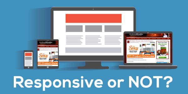
For a while now I’ve been thinking about updating the design of my blog, specifically – making it responsive.
If you don’t know what responsive design actually is, it basically means that the design of the blog automatically fits whatever device it’s being used on. So If you’re viewing it on your desktop, it will fit perfectly, but if you then go and view it on your mobile device, it will still fit perfectly (even though you’ve gone from a roughly 20’ screen to a 4-5’ one).
Spicy Auction Templates 3.0, which was just launched last week, utilises a responsive design, so please take a look at that if you want a better idea of what responsive design is and how it works.
Of course the whole idea behind responsive design it to make it easier to browse sites on a mobile device – a market which has grown hugely over the last few years.
And when I look at it in that way, it seems like an obvious choice to switch to a responsive design for my blog…
BUT there’s just something that keeps me from doing this – a nagging feeling that I shouldn’t go responsive. I think that my main worry is that the actual usability and functionality of the blog will be negatively affected.
Also, another very important consideration, many websites look dreadful when viewed on a mobile device – it’s zoomed in on a tiny part of the page, menus are impossible to use, etc. etc. – basically the whole layout is messed up.
But in the case of my blog, which has a fairly simple design in terms of layout, with just one main block and the navigation bar on the right, I think it still looks very good on a mobile device.
I personally use an iPhone, and on that at least the blog looks fine, never mind on an iPad or other tablet – as in my opinion desktop sites nearly always look fine on those as well.
But at the same time I know there are some people using smaller devices who may be experiencing problems with the current un-responsive design.
And that’s the crux of the problem really. There are pros and cons to both and I just cannot decide which option is best.
If I do transfer the blog to a responsive theme, that means the navigation bar which is currently on the right hand side of the page will move to the bottom and the top menu will become one of those drop-down menus (which I personally hate!).
 The desktop version will remain generally the same, functionality and layout wise, though of course the design will be altered slightly as I would have to change that to accommodate the responsive theme.
So really it all comes down to you, my blog readers – after all it’s only for your ease of use that I’m thinking about this change in the first place.
Do you use/read my blog on a mobile device?
If so, what are your thoughts? Is it fine for reading, but difficult to comment? Is it hard to utilise the menu and navigation bar in their current state? Are there any other problems that you’ve experienced?
I would greatly appreciate ANY comments from you all on this topic, as they will really help me make a final decision.
All the best,
Andrew


Hi andrew
Just read your blog on my iphone 4 & am replying you with it
I think you should leave the design the way it is. Its good apart from having scroll each text to the right side but what i do is to read all text in Pdf format, then problem solve. Thanks for the good works & time
Thanks for your comment Emmanuel!
I’m already working on responsive design for my blog so that should fix your problem! 🙂
Andrew
Hi
The site we download the templates from
Regards
Mark
oh, SAT – well, it’s already responsive! 🙂
Hi Andrew
I have iPhone 6 Plus the actual entrance site is fine, but when I sign in I have
To go landscape I can’t even pinch and see it all , as I say not a massive issue to me
Looks great landscape
Regards
Mark
Hi Mark,
Which website you’re referring to?
As you say you need to sign in…
Thanks,
Andrew
I would say responsive is the way to go.
To be fair, I only ever read your blog on my desktop computer because I think it deserves a level of attention that I don’t tend to give things I read on my phone.
But that said, a lot of people use their phones for almost everything to do on the internet, and this blog doesn’t look great on a small screen.
In my experience, changing my own website to a responsive design made a massive difference in terms of traffic and customer engagement.
So as long as you keep a sensible design for desktop viewing, I don’t think you’ve got anything to lose.
Kind regards
M
Thanks Mike, that’s what I’m thinking too! 🙂
Andrew
Personally I like it the way it is, your blog on my phone works fine. Templates site is good but I have to landscape my phone as all text is to the right in standard view. Not really an issue either way for me.
Mark
Thanks for your comment Mark, really appreciate it! 🙂
As for SAT website – what phone do you have?
As on my iPhone 6, Safari it looks all good in portrait mode too.
Thanks again,
Andrew
From the perspective of a web designer, I’ve always seen responsive as adding (but not subtracting) to a blog site. As the browser window becomes smaller, your site layout will adjust itself accordingly. In it’s simplest form, all responsive designs boils down to is:
– Main menu becomes a dropdown button instead of horizontally spread
– Sidebar widgets move to directly above or below your main page content
– Footer table shifts to vertical instead of horizontal (one column with three rows instead of three columns with one row)
You can even technically recreate your current design, customizing a responsive template so that the desktop browser looks EXACTLY the same as your old design and the only difference is mobile responsiveness. I wouldn’t recommend this because a little 21st century facelift is always appreciated online. But I point it out to help ease your concerns.
The hardest part about responsive designs is remembering to customize for the different window frame sizes when needed. Like if you want font links to be one color on desktop but another color on mobile. I redesigned an e-commerce site for a client recently to make it mobile friendly but kept the process simple by customizing an already responsive template and only focusing on three window frame size ranges: max-width 480px, max-width 768px, and min-width 769px. This way I was covering most smart phones, ipads, and desktop computers. Yes it takes a little bit more design time but it’s totally worth it. After I launched the new e-commerce site, the first sale was from an iPhone. That’s the idea, right? Good luck Andrew!
Thanks for your comment Marc!
Yes, I’m fully aware of how responsive design works 🙂 I have done many responsive projects.
With this post though, I wanted to hear more from people who already read my blog from mobile devices, with current set-up to know how good or bad their experiences have been.
But thanks anyway for your comment!
Andrew
Responsive is definately the way to go as you can increase your user base by accessing more devices and more people so definately worth the time and money in terms of investment in my opinion.
Thanks Rafeeq!
I know, yes. I already get about 30% traffic from mobile users, so it’s not like I’m leaving them out right now.
What I would like to hear more about is how my blog “works” for people who use mobile devices to read it, from usability perspective. is it working ok for them or it’s difficult to click on menu links, buttons etc.
Thanks,
Andrew